Exploration
Appealing to a niche
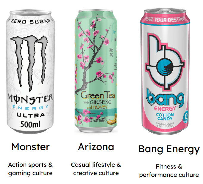
If you look at the most popular energy drink brands, they have branding that already pulls on pre-existing aesthetics.
Monster energy drinks are cool to teens because the design reflects alternative fashion.
I think it would be best for this project if the design tries to appeal to a specific niche, popular with our target demographic rather than a nondescript energy drink brand that looks great but doesn't appeal enough to anyone to pick it up from a shelf for the first time.

The niche: High-caffeine fitness drinks for women
There is a clear gap in the market for a female focused fitness drink. Brands like Monster, Red Bull and Bang are heavily male orientated, while female focused brands often prioritise bold marketing and flavours over fitness.
This creates an opportunity for a high caffeine drink that combines intense energy with bright, playful packaging, offering women a fun and fitness focused alternative to the current market.
Brand Identity
Colour Palette and Textures

Logo Design

I decided to choose the top centre logo to iterate on. I liked how legible the logo was from a distance, and i liked how the arrows symbolised energy
The earlier iterations with the brighter logo looked more playful, but the simplified version is more versatile and stands out better across different packaging and backgrounds.

Macot Design
I tried to keep the designs looking fierce and bold as it is a common theme in energy drinks, but I added some more bold bright colours to make it seem more eye-catching on drinks stands.
As little details I added leaves to the ears and make the line art on the face look liquid as it is a drinks brand.


Final Designs
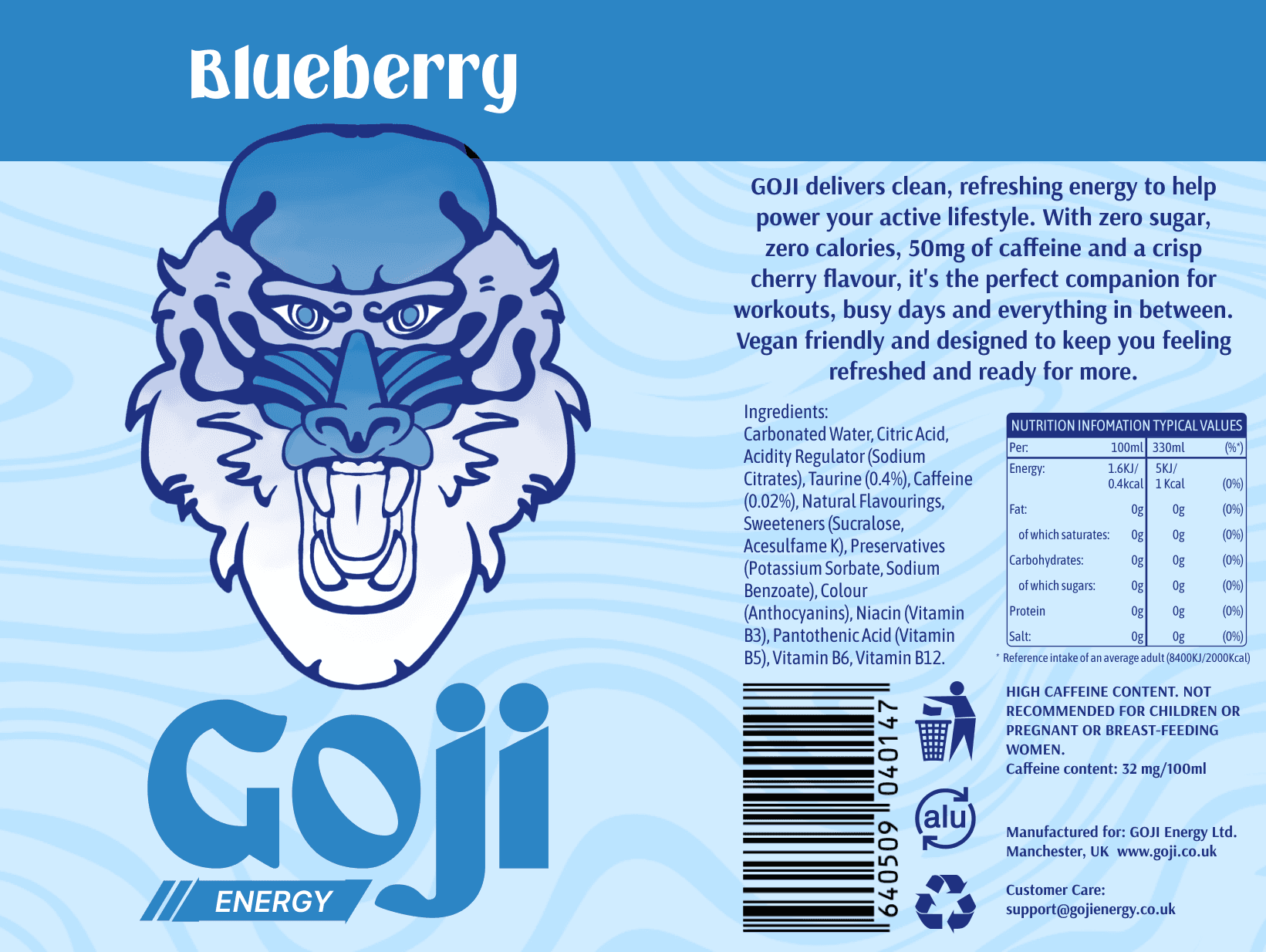
Can Design


Mockups

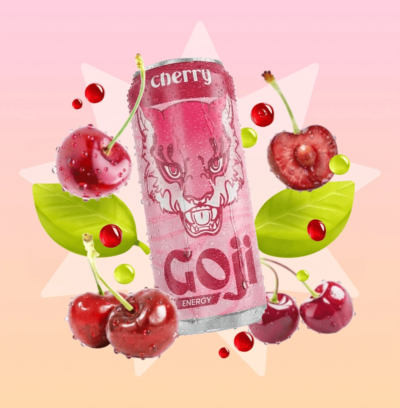
AI Generated Ad Concepts


Multipack packaging


Social Media
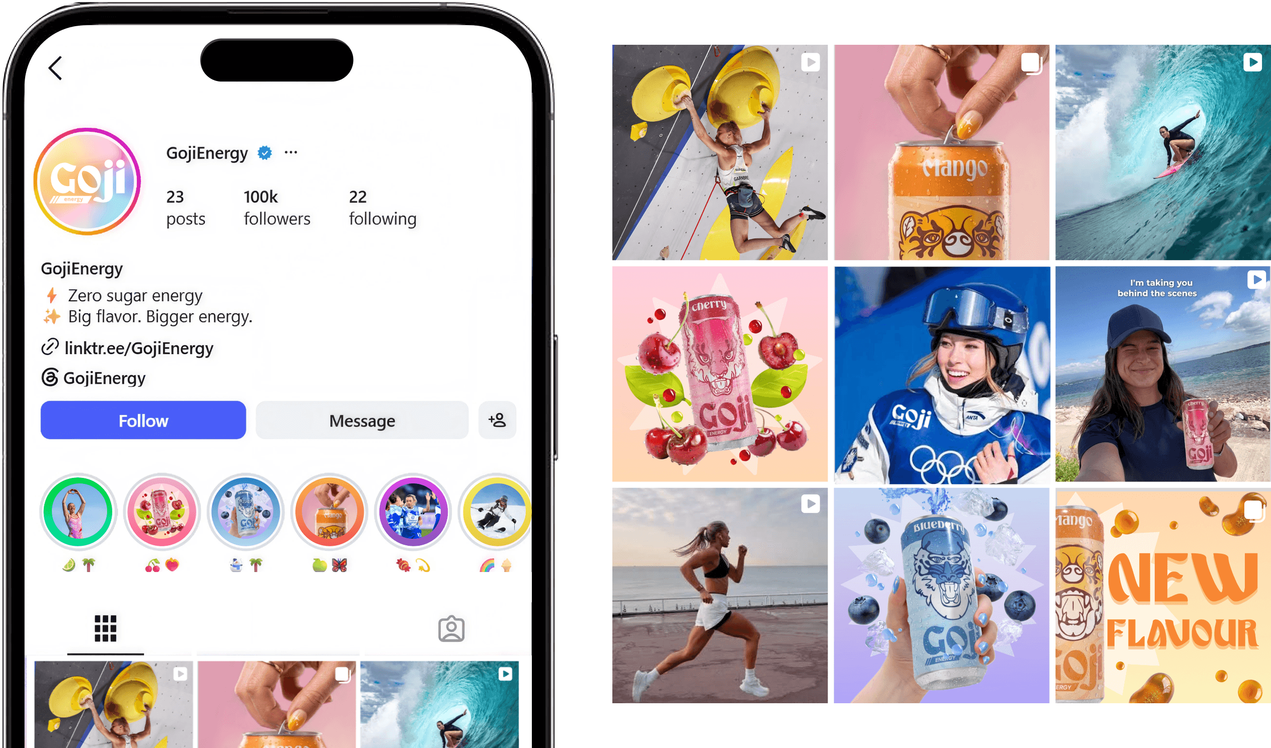
Most products that try to appeal to women in the fitness space have very strong social media presences. E.g. Gymshark, Lululemon, Bloom Nutrition.
I wanted to position the brand as more than just a functional energy drink, instead making it feel like part of an active and aspirational lifestyle. I chose to feature female athletes across a range of sports, helping the brand feel more inspiring while connecting with its target audience.